
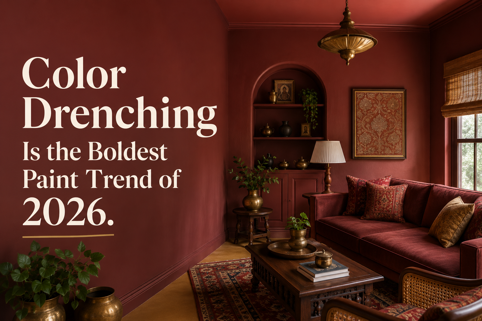
There’s a specific kind of design bravery required to pick up a paintbrush and coat more than your walls but your ceiling, your trim, your door, and your built-ins in the exact same color. Most of us were taught to keep the ceiling white. The trim should be crisp and bright. Break it up, pull the eye around the room.
Color drenching says: ignore all of that.
And honestly? It works. Better than most people expect, and in ways that solve problems other techniques can’t. Small rooms feel larger. Awkward architectural details disappear into the color instead of fighting each other. And a room painted in deep forest green from baseboard to ceiling has a quality of presence that a standard two-tone paint job can’t match.
So What Exactly Is Color Drenching?
The name is pretty literal. You’re drenching the room in color, not applying it selectively, but committing to it on every surface. Walls, ceiling, trim, door casings, window frames, sometimes even the furniture.
The effect is immersive and intentional. When every surface is the same color, the eye stops parsing the room into its component parts and starts experiencing it as a whole. It feels like being inside a color rather than looking at it.
This is a very old technique. Georgian-era British design did this all the time, swathing drawing rooms in deep reds and greens to create a cocooning warmth. What’s new is that a younger generation of decorators is rediscovering it and applying it in modern spaces, sometimes with very dramatic results. See our full DIY & Paint guides for more wall treatment ideas.
Why It’s All Over Feeds Right Now
Color drenching isn’t entirely new, but it’s having a serious 2026 moment. Interior designers are reporting a huge uptick in clients requesting it, and paint companies have been releasing color drenching-specific guides alongside their trend forecasts.
The timing makes sense. People have gotten braver with color generally, earthy terracottas, deep greens, and moody navies have been building for several years now. Color drenching is sort of the logical conclusion of that bravery: if you love this color enough to put it on your walls, why stop there?
There’s also the small-room problem. If you have a bathroom, a powder room, a home office, or a dining room that feels cramped and awkward, color drenching is one of the most effective fixes. The reason is optical: when the walls, ceiling, and trim all match, the eye doesn’t catch on the corners and joints between them. The room reads as a continuous surface, and that reads as larger.
The Best Colors to Try
Not every color works equally well for a full drench. The best ones tend to be:
Deep, saturated greens are leading in 2026, sage, eucalyptus, bottle green, olive. They bring nature inside without reading as earthy in a muddy way, and they pair with wood tones, brass, white ceramics, and natural fibers beautifully. A sage-drenched study with wood bookshelves and a leather chair is one of those rooms you see once and never forget.
Moody blues and navies are perennial favorites for this technique. Navy in a powder room, ceiling and all, turns a functional little space into something that feels sophisticated. It also plays beautifully with white fixtures and brass hardware.
Warm terracottas and dusty roses feel unexpected but work brilliantly in bedrooms or small sitting rooms. They’re enveloping in the best way, like being wrapped in something warm.
Rich moody tones like plum, oxblood, and deep charcoal read dramatic but not overwhelming when the color is consistent throughout. The key is that the variation in light throughout the day does the work of keeping it from feeling flat.
Lighter colors, pale beige, off-white, soft lavender, can also be drenched, and the effect is subtler but still noticeable: a room that feels cohesive and intentional in a way that a basic one-color-on-walls approach doesn’t.
How to Do It (The Technical Part)
The key to a color drench that looks polished rather than rushed is finish variation. You’re painting everything the same color, but not necessarily the same sheen.
Here’s a finish guide that designers use:
- Walls: matte or flat finish, absorbs light, makes the color feel rich and velvety
- Ceiling: also matte or flat, which creates a subtle differentiation from the walls through light reflection without breaking the color continuity
- Trim, door casings, window frames: satin or eggshell, a slight sheen that catches light and gives the architectural details their due without making them pop out of the color story
- Doors: semi-gloss on the door itself reads as intentional and polished
This variation in sheen is what separates a well-executed color drench from a room that just looks like someone painted everything at once and called it done.
Before you commit, buy a full-size sample and paint a 2×2 foot section on the wall AND a section on the ceiling. Colors look dramatically different on horizontal versus vertical surfaces and in different light conditions. The ceiling paint reads darker, always. Account for that.
Which Rooms Work Best
The technique shines in smaller, more contained spaces where you want maximum impact:
Powder rooms and guest bathrooms are the easiest place to start. Small square footage means you’re not committing a huge amount of time or paint, and the result is always dramatic. A deep navy or forest green powder room feels like walking into a boutique hotel.
Home offices and studies respond beautifully to color drenching, particularly in deep greens or warm clay tones. There’s research suggesting that enveloping color environments can help with focus. Whether or not that’s true, a sage-green study feels like a place where things get done.
Dining rooms are a classic color-drenching candidate. Dining rooms are typically used only in the evenings when candles are lit, which means the color gets to show off in the most flattering light. Deep reds, navies, moody greens, all exceptional in this context.
Bedrooms benefit from the cocooning effect. A warm terracotta or dusty rose bedroom, walls and ceiling included, creates a restful, enveloping quality. Keep the bedding and textiles lighter (creamy whites, natural linens) to balance the depth.
What to Put in a Color-Drenched Room
Because the room itself is making a statement, the furniture and accessories can be quieter. You don’t need a lot. In fact, less is more here.
Focus on natural materials: wood, linen, wool, ceramic, rattan. Let the color be the backdrop for things that have texture and warmth. A single large piece of art in a complementary tone can be striking in a color-drenched room, or you can skip art entirely and let the room’s architecture do all the talking.
Brass and gold-toned metals are excellent in color-drenched spaces, especially with darker colors. They catch the light in a way that lifts the room without breaking its mood.
If you’re nervous, start with a room where you can afford to experiment. A powder room costs relatively little to repaint. A home office can easily be changed. Use the smaller space as a confidence-builder, and by the time you’re ready to drench a bigger room, you’ll know exactly what you’re doing.
Color drenching rewards boldness. The whole technique is about committing. Go in, pick your color, drench it, and live with it for a few days. You’ll almost certainly want to do it again. Browse our recommended products including our favorite paint brands and brushes to get started.
Related guides
- Curved Furniture for the Living Room: What Works
- Curved Furniture: How to Use It Without Overdoing It
- Grandmillennial Style: How to Decorate With Pattern
- How to Style a Bookshelf, Shelf by Shelf
Browse home decor to shop the pieces mentioned here.