
Most people avoid mixing patterns entirely, and honestly, I get why. One striped pillow next to a floral chair next to a patterned rug sounds like a recipe for a room that gives everyone a headache. So the safe move is to go all-solid, one neutral sofa, one plain rug, maybe a single throw pillow in a “safe” print, and call it a day.
But here’s my actual take: an all-solid room is the thing that’s boring, not the mixed-pattern one. The rooms that stick in your memory, the ones that feel like someone lives there and has opinions, almost always have at least two or three patterns working together. The failure mode isn’t mixing patterns, it’s mixing them without a system.
Why Most People Get This Wrong
The mistake isn’t choosing “too many” patterns. It’s choosing patterns that are all the same scale and same intensity, so instead of layering, they compete. A medium floral next to a medium plaid next to a medium geometric is visual noise because your eye can’t find a hierarchy, everything is shouting at the same volume.
The other common mistake is treating color and pattern as separate decisions. They’re not. If your patterns don’t share at least one common color, they’ll read as randomly assembled no matter how well the scales work together. This is the single most useful thing to understand about the whole exercise: patterns don’t need to match, but they do need a shared color thread running through them.
The Right Way to Think About It
Treat pattern mixing like you’d treat a wardrobe outfit, you need a large piece, a medium piece, and a small accent, and they shouldn’t all be trying to be the main character. In a room, that translates to: one dominant pattern (usually your largest textile, a rug or a set of curtains), one medium-scale supporting pattern (an accent chair or a set of pillows), and one small-scale pattern used sparingly (a lumbar pillow, a table runner, a lampshade).

Vary the scale deliberately. If your rug has a large, loose pattern, your pillows should either go much smaller and tighter, or solid, to give the eye somewhere to rest. Two large-scale patterns in the same room almost always fight each other, no matter how nice each one is individually.
And keep a neutral or solid anchor somewhere prominent, your sofa, your walls, your largest piece of furniture. This is what lets patterned accents feel like intentional layers instead of a room that’s trying to do too much at once. A moody color palette makes this easier than an all-white room does, because a deep wall color already does some of the anchoring work for you, leaving your patterned textiles free to be bolder.
How to Apply It
Start with the piece you’re least likely to replace, usually a rug or a sofa, and build outward from there. Pull two or three colors directly from that piece and let those become the palette every other pattern in the room has to reference.
From there, layer in one pattern per surface, not per room. A striped rug, a floral pillow, a solid throw, a geometric lampshade, that’s four surfaces, three patterns, and one solid, and it reads as curated because each pattern gets its own lane instead of competing for the same surface.
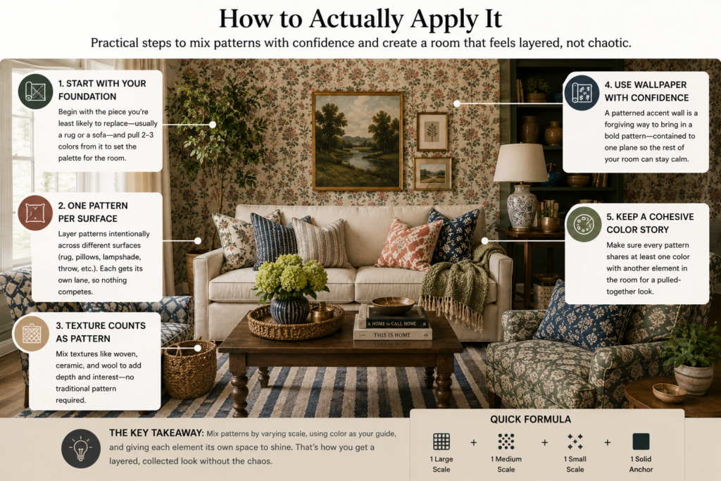
Texture counts as pattern too, and it’s the easiest entry point if you’re nervous. Mixing a woven jute basket, a smooth ceramic vase, and a nubby wool throw creates visual variation without a single “pattern” in the traditional sense. If you’re building this up gradually, mixing wood tones across furniture pieces follows the exact same logic, different textures and finishes coexisting because they share an underlying warmth or color family.
Wallpaper is where a lot of people chicken out entirely, but a patterned accent wall is one of the more forgiving ways to introduce pattern, because it’s contained to one plane and everything else in the room can stay simple in response. If you’ve been curious about this, wallpaper’s comeback as a design tool makes a strong case for using it as your one big pattern statement and keeping the furniture around it quiet.
What to Avoid
Don’t mix more than three patterns in a single room unless you know what you’re doing, even professional stylists tend to cap it there. Beyond three, you need serious color discipline to keep it from looking chaotic, and it’s just not worth the risk for most rooms.
Avoid patterns of identical scale sitting next to each other. Two medium florals, even in coordinating colors, will still compete because your eye reads them as “the same size decision” rather than a hierarchy.
And don’t ignore your existing furniture when picking new patterns. If your sofa already has texture or a subtle pattern woven into the fabric, that counts as one of your patterns whether you intended it to or not. Plan around what’s already there instead of pretending the room is a blank slate.
Final Thought
The rooms that feel flat aren’t the ones with too much going on, they’re the ones where every decision played it safe in the same direction. Pattern mixing done with a plan is one of the fastest ways to make a room feel like it has a point of view instead of looking like a showroom nobody lives in. Pick your anchor, vary your scale, keep a color thread running through everything, and you’ll end up with a room that looks pulled together rather than accidental.
Related guides
- Rental Home Decor Ideas India, No Drilling Needed
- Small Entryway Ideas When You Have No Foyer
- Small Decor Details That Make a Home Look Designed
- Home Decoration Ideas That Work in Indian Homes
Browse home decor to shop the pieces mentioned here.