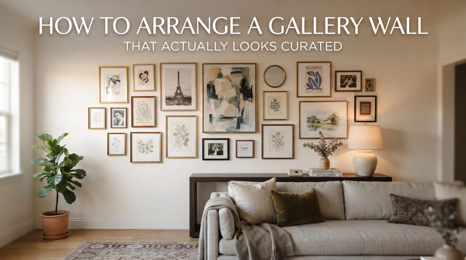
Everyone has tried this at least once. You buy five or six frames, prop them against the wall to “plan it out,” and twenty minutes later you’re standing in a pile of nails and painter’s tape wondering why the version in your head looked so much better than the one on your wall. Gallery walls are one of those projects that look effortless in photos and feel like a puzzle with missing pieces the moment you attempt one.
a good gallery wall isn’t about the art. It’s about spacing, sightlines, and a plan you commit to before a single nail goes in. Skip the planning step and you’ll end up with the classic beginner gallery wall, too spread out, no clear anchor, everything floating in its own little island of white space.
What You’ll Achieve
By the end of this, you’ll have a wall arrangement that reads as one cohesive piece rather than a scattered collection of frames. We’re talking consistent spacing, a clear visual anchor, and a layout that works whether you’re doing five frames or fifteen. This works above a sofa, along a staircase, in an entryway, or on that one awkward blank wall every house seems to have.
Step 1: Measure the Space, more than the Frames
Before you touch a single frame, measure the wall itself. A gallery wall above a sofa or console should generally take up about two-thirds to three-quarters of the furniture’s width, go much wider and it looks like it’s floating away from the piece it’s meant to anchor. Note the total width and height available, and keep about 6 to 8 inches of breathing room between the top of your sofa or console and the bottom edge of the arrangement.
If you’re working with a totally blank wall (no furniture reference point), center the whole arrangement so its middle sits around 57 to 60 inches from the floor, that’s roughly eye level for most adults, and it’s the same rule museums use.
Step 2: Lay It Out on the Floor First
This step is not optional, no matter how confident you feel. Lay your frames out on the floor in the shape you’re planning, using painter’s tape to mark the boundary of your wall space if it helps. Start with your largest or most important piece, this becomes your anchor, and everything else gets arranged in relationship to it.
A few layout options that work:
- The grid: Uniform frame sizes, evenly spaced, in clean rows and columns. Forgiving and modern, especially with black or matching frames.
- The salon style: Mixed sizes arranged organically, almost like a puzzle. Harder to plan but more visually rich, this is where the floor-first step pays off.
- The horizontal line: A single row of frames aligned along one horizontal axis, either by top edge, bottom edge, or center. Clean and works well in narrow hallways.
Once you’re happy with the floor version, trace it. Cut kraft paper or newspaper to the exact size of each frame, tape the paper templates to the wall in your planned arrangement, and you now have a full-size stencil for where every nail goes.
Step 3: Keep Your Spacing Honest
Consistency is what separates a gallery wall that looks designed from one that looks accidental. Standard spacing between frames is 2 to 3 inches, tighter than that and it reads as cluttered, wider and the pieces stop relating to each other visually. Measure this gap the same way between every pair of frames, more than eyeballing it as you go.
If you’re mixing frame sizes, let the larger pieces have slightly more room to breathe and cluster smaller frames closer together in pairs or trios, this is a trick professional stylists use constantly and it makes a huge difference in how “intentional” the wall feels.
Step 4: Install with a Plan for Mistakes
Use your paper templates and a level. Hammer a small nail through the center of each paper template directly into the wall, then tear away the paper once the nail is set. This way you’re never guessing, and every frame goes up exactly where you planned it on the floor.
For anything heavier than a standard poster frame, use the appropriate wall anchor for your wall type, drywall anchors for hollow walls, and for anything over five pounds, try to catch a stud where you can. Command strips work fine for lightweight prints but tend to struggle with anything heavier than a small canvas.
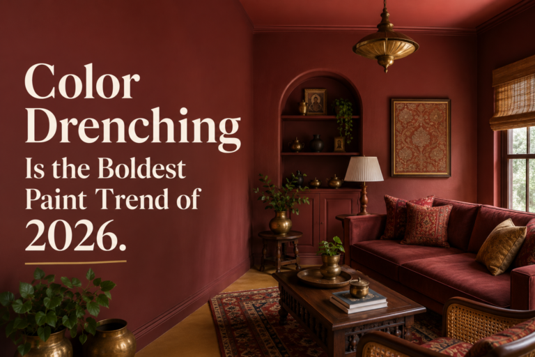
If your color palette needs a refresh before you commit to a gallery wall, it’s worth looking at how a moody, richer palette changes the way artwork reads on the wall, darker backgrounds especially make frame edges and mats pop in a way white walls sometimes flatten out.
Common Mistakes to Avoid
The single biggest mistake is hanging everything too high. People instinctively want gallery walls to feel grand, so they hang them higher than eye level, and the whole thing ends up floating awkwardly near the ceiling instead of relating to the furniture below it.
The second mistake is inconsistent frame styles without any unifying element. Mixing frame finishes is fine, encouraged, but you need at least one thread tying it together, whether that’s color, a shared mat width, or all-black hardware. Without that thread, a mixed gallery wall just looks like leftover frames from different eras of your life, which, to be fair, it might be.
And don’t skip the artwork itself. If your frames are empty of anything meaningful, consider incorporating a few textural or handmade pieces, quilted wall art adds a dimension that flat prints can’t, and mixing in one or two dimensional pieces among your framed prints keeps the whole wall from feeling one-note. Browse the full range of wall hanging art options if you need a starting point before you even get to the layout stage.
The floor-planning step is the one people skip because it feels slow, and it’s the one that saves you from a wall full of unnecessary nail holes. Give yourself the twenty minutes on the floor. Your walls will thank you.
Once you’ve got your layout locked in, resist the urge to add “just one more thing” every time you walk past an empty spot near the edges. A gallery wall that breathes is more sophisticated than one that’s crammed edge to edge, leave the white space where it belongs.
Related guides
- Curved Furniture: How to Use It Without Overdoing It
- Dining Table Centerpiece Ideas That Look Effortless
- Grandmillennial Style: How to Decorate With Pattern
- Rug Size Guide: How to Choose for Every Room
Browse living room decor to shop the pieces mentioned here.